PLOTLINE 5: FRANCESCA WOODMAN / Traces of Performance

Francesca Woodman. Polka Dots, 1976. 4 11/16 x 3 7/8 in.
Gelatin silver print.

"Anything we have not had to decipher, to bring to light by our own effort, anything which was already clearly visible, is not our own.”
- Marcel Proust, Time Regained (1913)

Francesca Woodman. Polka Dots, 1976.
5 5/16 x 6 1/4 in. Gelatin silver print.

Francesca Woodman. Untitled, c. 1975-78. 5 3/16 x 5 5/16 in. Gelatin silver print.
"The side rooms and exterior spaces we glimpse through door cracks and windowpanes in Woodman’s pictures are not just natural extensions of the real space; they do not simply abut the familiar rooms. On the contrary, they seem to constitute a mysterious nowhere, a radical elsewhere whose disturbing presence, though palpable, is unfathomable."
Binotto, Johannes. "Outside In: Francesca Woodman's Rooms of Her Own." Francesca Woodman: Works from the Sammlung Verbund. Köln: Buchhandlung Walther König and New York: Artbook, 2014.

Images from left to right: Francesca Woodman. Untitled, c. 1977-78. 7 15/16 x 7 1/4 in. Gelatin silver print. /
Francesca Woodman. Untitled, c. 1977-78. 3 1/4 x 3 5/16 in. Gelatin silver print.

Francesca Woodman. Untitled, c. 1979-80. 11 x 14 in. Gelatin silver print.
"Woodman–in manifest opposition to the reigning practices of artistic and photographic production of the late Sixties and Seventies from Conceptualism to Simulation–foregrounds precisely those dimensions that are in fact as integral to the photographic as its mechanical precision, its optical indexicality and immutability. Thereby the artist fulfills another of photography’s initial promises and singular qualifications, to give us a ‘mirror with a memory.’ Woodman articulates precisely those processes that are seemingly inaccessible to the ‘bare’ eye of photographic optics, such as its capacity to trace the processes of changing light and movement, or its capacity to trace temporality, to make the passage of bodies through space immediately apparent.”
Buchloh, Benjamin H.D. "Francesca Woodman: Performing the Photograph, Staging the Subject." Francesca Woodman: Photographs 1975-1980. New York: Marian Goodman Gallery, 2004.

Francesca Woodman. Untitled, c. 1977-78.
3 7/8 x 3 7/8 in. Gelatin silver print.
"When Woodman shows herself in her pictures, she not only uses the rooms to stage herself and her body. The converse is also true: the artist uses her own body to illustrate the unusual spatial qualities of her scenes. The body is the medium that allows us to experience space…"
Binotto, Johannes. "Outside In: Francesca Woodman's Rooms of Her Own." Francesca Woodman: Works from the Sammlung Verbund. Köln: Buchhandlung Walther König and New York: Artbook, 2014.

Images from left to right: Francesca Woodman. Untitled, c. 1977-78. 4 5/8 x 4 9/16 in. Gelatin silver print. /
Francesca Woodman. Untitled, c. 1977-78. 3 7/8 x 3 7/8 in. Gelatin silver print.

Francesca Woodman. Untitled, c. 1977-78.
4 1/4 x 4 1/8 in. Gelatin silver print.
“It is this insistence of the paradoxical beyond that renders even a seemingly plain picture like the shot of a corner of a room profoundly disconcerting. In this instance, the mysterious out-of-field is present not in one but in two ways: there is, on the one hand, the blazing light streaming in through the windowpane, which does not let us see what is outside in the bright light of day; and, on the other hand, the darkness looming from the nook beneath the drywall construction; we cannot know how far this darkness extends."
Binotto, Johannes. "Outside In: Francesca Woodman's Rooms of Her Own." Francesca Woodman: Works from the Sammlung Verbund. Köln: Buchhandlung Walther König and New York: Artbook, 2014.

Francesca Woodman. Untitled, c. 1979-80.
7 1/8 x 7 in. Gelatin silver print.

Francesca Woodman. After My Grandmother's Funeral, 1977. 5 x 5 1/8 in. Gelatin silver print.

Images from left to right: Francesca Woodman. Untitled, c. 1979-80. 5 1/2 x 5 5/8 in. Gelatin silver print. /
Francesca Woodman. Untitled, c. 1979-80. 5 5/8 x 5 5/8 in. Gelatin silver print.
“A while ago my pictures started getting smaller and smaller – now they are getting whiter and whiter soon there will just be small […] areas of glow.”
- Francesca Woodman

Francesca Woodman. Untitled, c. 1979-80. 3 7/8 x 5 5/8 in. Gelatin silver print.

Francesca Woodman. Untitled, c. 1979-80.
4 13/16 x 4 3/4 in. Gelatin silver print.
Please click on any image for a larger gallery view.
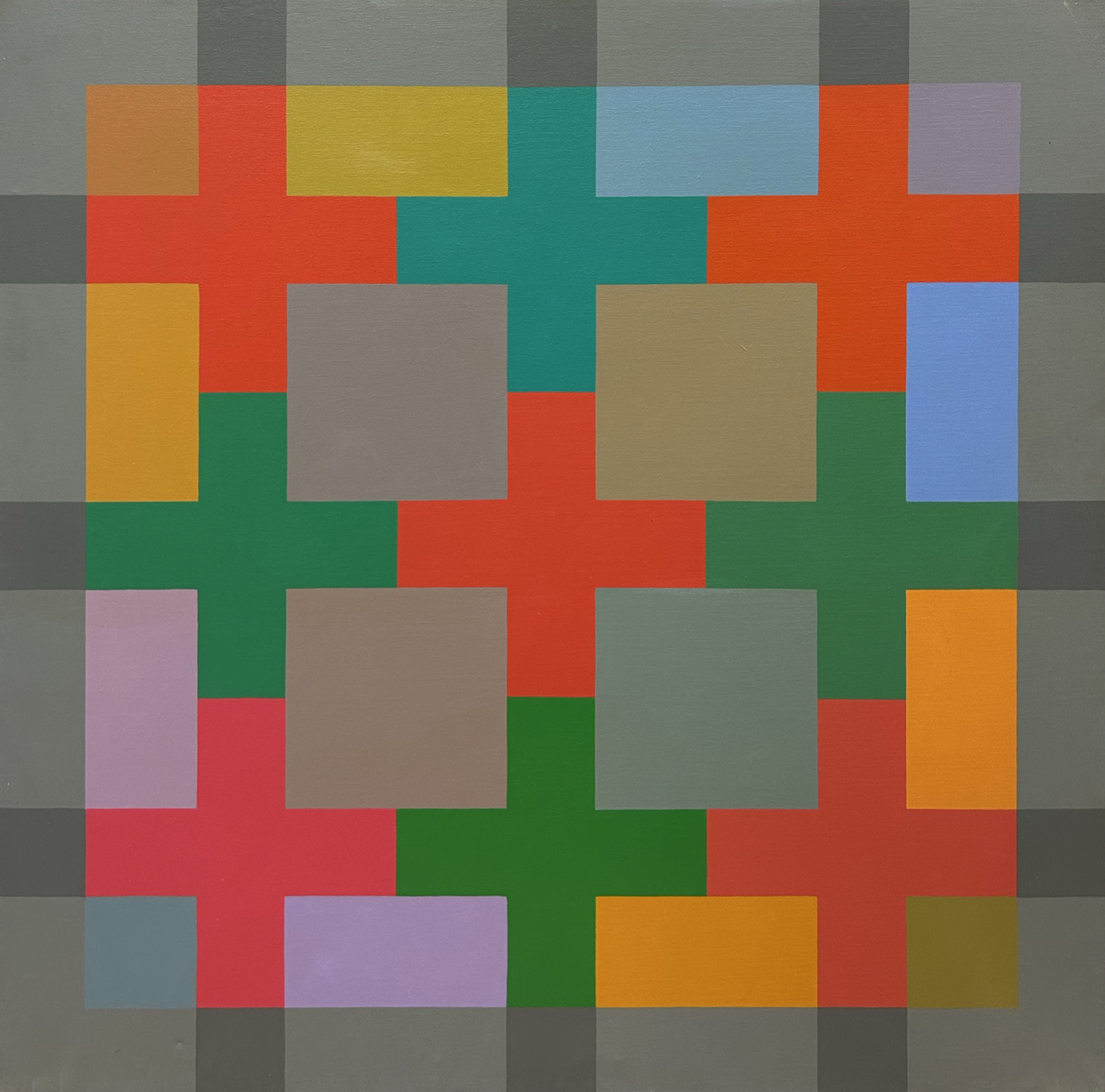
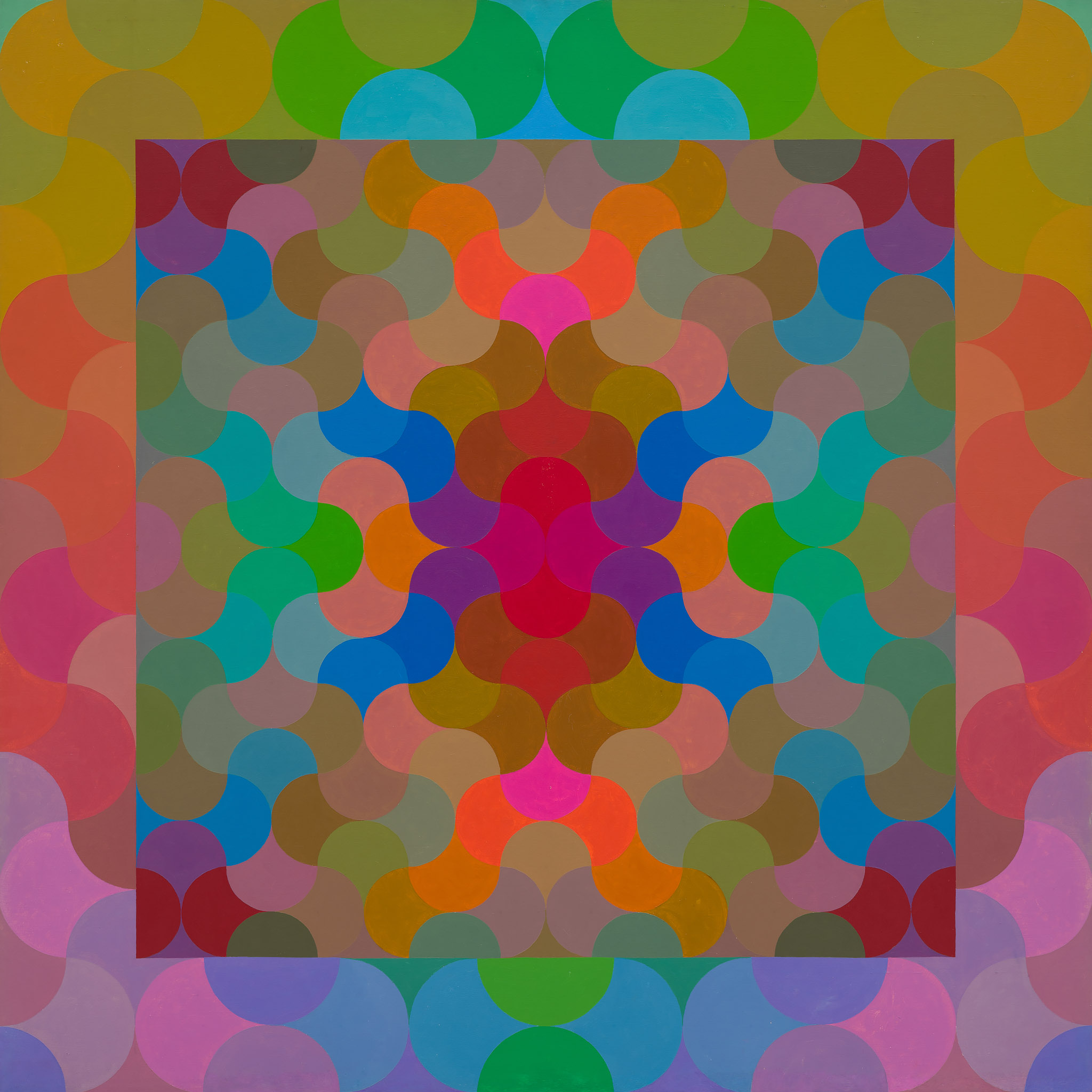
"Pattern may be the life-blood of decoration, but in turn its life is founded on the power of the mind. We should distinguish between pattern per se, as involving orderly principles of repetition coupled with symmetry, from merely pattern-like appearances. Excluded then are non-repetitive though symmetric forms such as heraldic devices, or fields of small forms without symmetry relationships such as the all-over paintings of Pollock or Tobey. The paradigms of pattern are printed wallpapers or serial friezes. For some Criss-Cross artists repetition is coupled to systemic change as expressed in progressions or fractal relationships.
"The intellectual origin of pattern is obscured by the fact that many artists are now borrowing patterns from the great decorative traditions. The point is that no matter how extended the chain of copying, patterns must ultimately by invented by someone, somewhere. Pattern, like perspective, is both about and based upon the nature of space. Each pattern is hemmed about and subject to rigid and complex laws of geometry. To work with pattern, even if only adjusting and adapting, requires a kind of insight into form which can only be called a rational intuition. This is equally true for ... craftsmen making rugs or Amish ... piecing quilts. To suggest otherwise would be unwarranted condescension. Work with pattern represents an unparalleled process of development or modification of sensory form in conjunction with insight into abstract principles of organization. The mental aspect of pattern-making may be unverbalized and unconnected to other symbol systems, such as mathematics. Also, it is radically different in kind from more familiar psychological aspects of art production such as emotion or desire. Patterns cannot be willed or felt into existence."
George Woodman. "Pattern." Criss-Cross Art Communications, Issue 10, 1979.

George Woodman in his studio, Tuscany, Italy, 1966.
"Woodman created the first of his fully developed systemic pattern paintings in 1966. 'My paintings were based on systems that determined a pattern, and then determined a color system,' Woodman said. This analytical bent is also reflected in his method of painting during this period which is marked by a meticulously crisp handling of the paint.
It is with these mid-1960s paintings that Woodman established himself as a pioneer nationally in the pattern painting movement—later called 'P&D' (pattern and decoration) which would become an important current in contemporary art ten years later, in the 1970s. But Woodman never felt a part of the P&D movement because, though he was painting patterns, they were only incidentally decorative, the color schemes having been generated through the formulas. 'I saw pattern as a kind of minimalism. My paintings were intellectual and rigorous, simple, yet rich and complex,' Woodman said."
Michael Paglia. “The Paintings and Photographs of George Woodman.” George Woodman: Sensuality in a World of Reason. Boulder: Boulder Museum of Contemporary Art, 1998.
Details of Trajan’s Column, 1966. / George Woodman. Trajan’s Column, 1966. 30 x 180 in. Acrylic on canvas.


Please click on any image for a larger gallery view and details.
"In this year in Italy, abstraction was confirmed at every turn from Romanesque inlay to the high geometry of Alberti. 'Cosmati' was a type of 13th century floor mosaic with circles and serpentines. I learned what I could from it all."
George Woodman. George Woodman: Paintings 1960-2000. Omaha: Bemis Center for Contemporary Art, 2006.

Cosmati tile detail Cattedrale di Anagni, Anagni, Italy. © Museo della Cattedrale di Anagni.
George Woodman. Cosmati, 1966. 60 x 60 in. Oil paint on canvas.

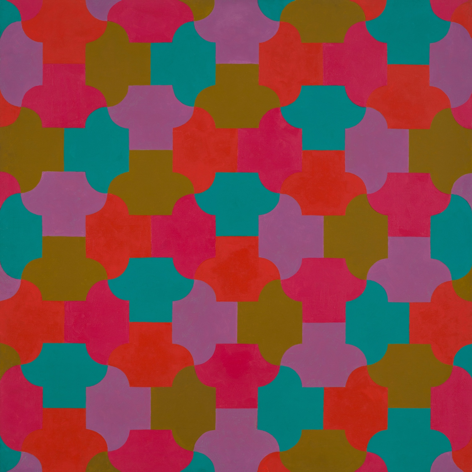
"The pictorial elements of Woodman’s pattern paintings are an asymmetrical geometric shape or a set of interlocking shapes, that are repeated in an all-over arrangement. The ancient floors of Italian churches and public buildings, which likewise are made up of all-over patterns of interlocking multi-colored shape, and which Woodman was and is very familiar with, may well have been an inspiration for his pattern paintings. But though it was in Italy, in 1966, that Woodman made what he calls a 'distinctive move' toward pattern painting, the die was cast only after a visit to Spain. 'A trip to the Alhambra in 1966, while it was not used as a source for pattern, convinced me absolutely that an art of purely pattern could be important, complete, rich,' Woodman has written."
Michael Paglia. “The Paintings and Photographs of George Woodman.” George Woodman: Sensuality in a World of Reason. Boulder: Boulder Museum of Contemporary Art, 1998.
George Woodman. Untitled, 1969. 48 x 48 in. Acrylic on canvas.
"Another constant is to be found in Woodman’s penchant for pattern, geometry, and architectonic frontally, elements of his affinity with the art of the Italian Quattrocento and Cinquecento and of classical antiquity. And at every stage there is the intriguing intimation of puzzles that have been solved but whose solutions are never obvious to the viewer."
Robert Berlind. “George Woodman’s Paintings.” George Woodman: Paintings 1960-2000. Omaha: Bemis Center for Contemporary Arts, 2006.

Detail of George Woodman. Untitled, 1968. 22 1/2 x 30 in. Screenprint on paper /
George Woodman. Untitled, 1968. 22 1/2 x 30 in. Screenprint on paper.

George Woodman. Untitled, c. 1966-68. 39 1/2 x 39 1/2 in. Acrylic on canvas.
"The shift in the mid-60s to patterned abstraction may be seen as a reprise of the transition earlier in the century from a still-descriptive cubism to a 'purer' non-referentiality. These paintings are equally in keeping with the cooler contemporaneous interests of Op Art and made a crucial contribution to the Criss-Cross movement which flourished during the 70’s in Boulder and had an impact on the New York scene."
Robert Berlind. “George Woodman’s Paintings.” George Woodman: Paintings 1960-2000, Omaha: Bemis Center for Contemporary Arts, 2006.

George Woodman. Untitled, 1969. 48 1/4 x 48 1/4 in. Acrylic on canvas.
"I contemplated the properties of hexagons. Five triangles can be combined to create an elbow shape and two mirror images of these shapes make an arrow form. These can be arranged on a field of hexagons so as to completely cover it without overlapping, thus creating what, in mathematics, is called a 'tessellation.' For two and a half years my work was based on this arrow form, trying variations in size, number of repetitions, and its reading as three-dimensional, all with different color harmonies and qualities of surface. Eventually with these forms, I composed images of clouds, mists, islands and the sea. It was a remarkable experience."
George Woodman. George Woodman: Paintings 1960-2000. Omaha: Bemis Center for Contemporary Art, 2006.
George Woodman. Homage to the Hexagon, 1971. 66 x 66 in. Acrylic on canvas.
George Woodman discussing his work on the occasion of George Woodman: Paintings 1960-2000, Bemis Center for Contemporary Arts, Omaha, Nebraska, 2007. © Woodman Family Foundation.
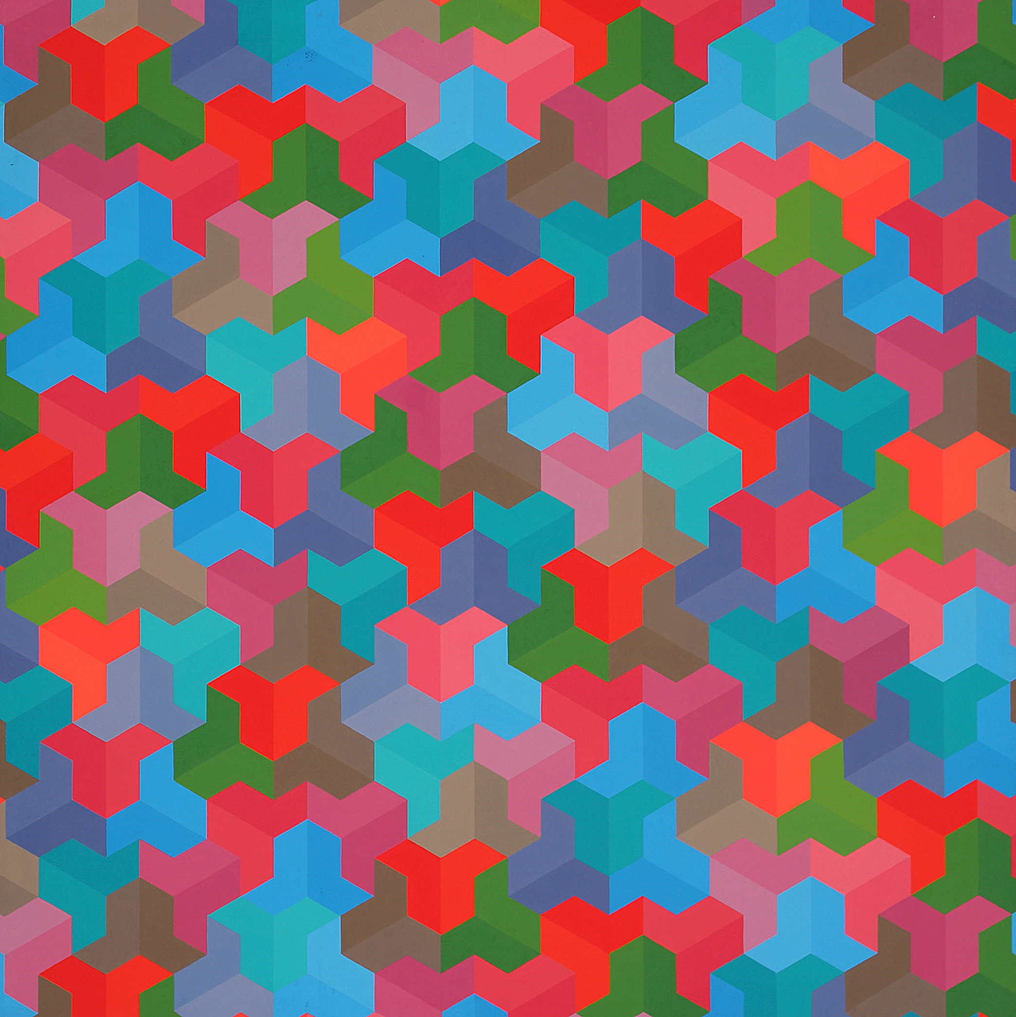
"George Woodman, who became a key member of Criss-Cross, used tessellations as his preferred vehicle of experimentation. In mathematics and life alike, tessellation refers to the covering of a flat plane with geometric shapes—tiles—that match up along their edges to cover the surface, never overlapping. Beginning in the early 1970s with elegant, modestly sized acrylic paintings, Woodman focused on periodic tiling—patterns that, when extended across a plane (say a floor, wall, or canvas), repeat regularly in all directions without overlaps or gaps. For Woodman, unlike other types of patterns, these infinitely extendable tessellations suppress figure-ground relationships thus emphasizing part to part continuity in favor of part to whole relationships. In this democracy of parts, 'composition' is sidestepped since the elements have no hierarchical relationship to each other, or a field, beyond their common participation in some combinatorial system which is in principle boundless in extension."
Rebecca Skafsgaard Lowery. “Infinite Progress: Criss-Cross and the Gender of Pattern Painting.” With Pleasure: Pattern and Decoration in American Art 1972-1985. Los Angeles: Museum of Contemporary Art, Los Angeles, 2019.
George Woodman. A Gentle Tessellation, 1966/1968. 43 1/4x 43 1/4 in. Acrylic on canvas.
"Pattern has been the fundamental motivation in George Woodman’s painting—and extensions out of painting—since the middle 1960s. More specifically, Woodman has concentrated on a kind of modular non-objective patterning, in which firmly defined units interlock with one another in tessellated formations. The basic formula is that simple, but the many variations Woodman has developed provide a broad range of visual modality."
Peter Frank. 19 Artists—Emergent Americans. New York: Solomon R. Guggenheim Museum, 1981.
George Woodman. Untitled, 1975. 32 1/4 x 32 1/4 in. Acrylic on canvas.
George Woodman. Tessellation Sky, 1975. 54 1/2 x 54 1/2 in. Acrylic on canvas.
From the collection of the Solomon R. Guggenheim Museum.
"For George Woodman, the 'rational' pattern painters of the (Criss-Cross) collective were different than the 'decorative' painters of P&D in that the former eschewed 'sentimental or sophisticated chic, and the cult of personal expression.' Pattern was not limited to the realm of the theoretical for Woodman, who avowed that the paradigms of pattern in the decorative world were manifest in wallpaper and serial friezes; it was all over designs without symmetry that should be dismissed as 'merely pattern-like.'"
Rebecca Skafsgaard Lowery. “Infinite Progress: Criss-Cross and the Gender of Pattern Painting.” With Pleasure: Pattern and Decoration in American Art 1972-1985. Los Angeles: Museum of Contemporary Art, Los Angeles, 2019.

George Woodman. Val di Chiani, 1978. 79 x 82 in. Acrylic on canvas.
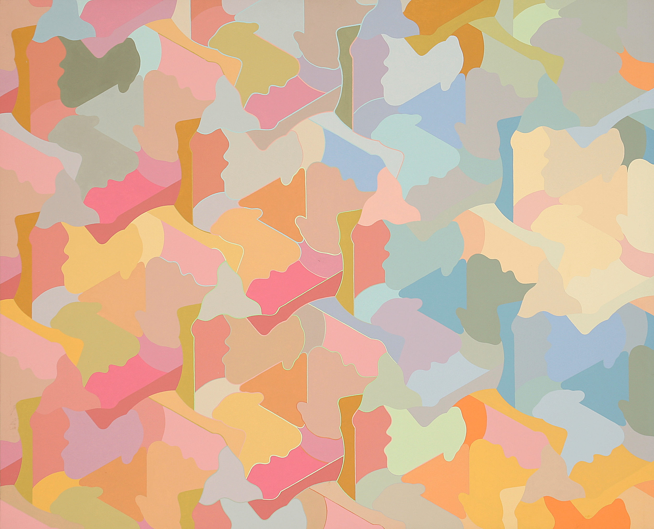
"Form plays a prominent role—and an idiosyncratic one, considering how Woodman struggled to raise his allover compositional mode above the level of mere decoration. He built on the positive-negative ambiguity of interlocking patterns as far back as 1966; more recently, Woodman has superimposed two independent patterns in the search for a modulated counterpoint. And recently too, Woodman has broken his unwritten vow of non-objectivity by introducing representational silhouettes into his pastel-toned jigsaw puzzles.
The twin emphases of form and color come together most forcefully in the various paper tile installations Woodman has realized since 1978. Literally building on ideas inherent in things as common as children’s block games, Woodman has created a kind of 'endless tessellation,' one that refers almost mockingly to the wallpaper-like function to which detractors once assigned Woodman’s and others’ patterned art."
Peter Frank. 19 Artists—Emergent Americans. New York: Solomon R. Guggenheim Museum, 1981.
George Woodman. Wooster Diptych, 1978. Two panels, 71 x 59 in. Acrylic on canvas.
"The paper tilings literally constitute a physical realization of a new approach to thinking about pattern that came about in the paintings of the summer of 1978. It was then that what I have called nonperiodic patterns were first used. These are constructed of identical repeated forms to produce configurations which in themselves do not repeat. From one area to another, the perceptual gestalt may be very different, although the tiles in each are identical. In the Wright State pieces, there is a constant flirtation with paradox. From one part to another, the pieces are unpredictable in the way that the larger forms read. Yet beneath this, there is a high degree of similarity in all of the components. In some respects this is exactly the opposite of normal perceptual situations in which the idiosyncrasies of the individual are lost in the uniformity of the crowd."
George Woodman. "Art and Methodology." Paper Tilings. Dayton: Wright State University Galleries, 1982.

All images from Paper Tilings by George Woodman, Wright State University Galleries, 1982.


"My paintings have consisted of a field of repeated forms derived from the grid. They could be described as pictures of possible tiles. Frequently working in Italy, I was influenced by both Roman and medieval mosaic. In 1966, I went to Spain and visited the Alhambra with its precious Moorish tiling from about 1300. I understood for the first time that tile could be an art form as profound, complex and moving as any other. Since then I have had the opportunity of studying tile in Turkey, Morocco and India, as well as in those great centers for tile, Portugal and Mexico."
– George Woodman, 2015

Tile detail Alhambra, Granada, Spain.
"In 1978, the pattern elements of my painting finally led to embracing tile, but not in ceramics. I had designs printed in black on squares of white paper, which could then be arranged as a temporary 'tiling' on a floor or a wall. These 'paper tilings' were eventually presented as “installations” in art galleries. Between 1979 and 1983, I was invited to several art schools in which I collaborated with students to paint hundreds of paper tiles, which were then assembled in large colorful murals or floor designs. This gave me the possibility of wide experience in tile design without involvement in ceramics. My first real tile commission came from Betty in 1982, when she persuaded me to tile the walls and floor of our bathroom. It was a thrilling initiation into the world of true ceramic tile."
– George Woodman, 2006

George Woodman's tile installation at home in Antella, Italy.
"My tile is NOT intended to be seen from a specific 'viewpoint,' to be 'taken in' like a picture or a painting, but to be grasped by a viewer in motion, in passing and from various perspectives. Thus it has a temporal dimension, in a way is cinematic. It is designed to be rewarding when only glimpsed in part or while doing other things. The designs have a deliberate redundancy so that if a portion of the tile wall is obscured by a person standing before it or a momentary reflection from shifting light upon it, the overall integrity of the experience is not diminished."
– George Woodman, 2007

George Woodman, ceramic tile installation, 1984, Delavan-Canisius College Station, NFTA-Metro, Buffalo, NY.


"In the second Detroit murals of 2003, I created a module made up of 10 different tiles. When I came to design the panels, I began to break and fracture the modules, to use them in a way in which they wouldn’t 'work,' the lines would not flow so smoothly from one tile into the next. I had the 'rules' of a modular system but in a deliberate way broke the rules with some frequency. I became interested in the appearance of “mistakes” in tilings encountered in places as diverse as the colored cement tiles, circa 1910, in apartment floors in Naples or in Indian houses where a few left-over tiles from some other project are often tossed in to fill some gaps. The impact of these unpredictable events have a kind of beauty not found in the 'correct' pattern in which they occur. To my eye at this point in my life, a tight pattern seems coercive, restrictive. In these murals there is an element of capriciousness, a playing of the rules against themselves. It seems like dissonance and harmony in music. Order and disorder, balance and imbalance, humor, surprises and even jokes are now appreciated. Logic is still of fundamental importance, but there is plenty which is allowed to escape its grasp."
– George Woodman

George Woodman, ceramic tile mural for the Renaissance Center Station, Downtown People Mover, Detroit, Michigan, 1987/2004.

Please click on any image for a larger gallery view and details.
"This journey of ours through the extensive oeuvre of Betty Woodman reveals a growing movement, freed from the functional object and centered upon the ornamental object, which gradually established itself as a sculptural construction and support for painting, eventually reaching a monumental dimension in installations that structure architectural spaces and in great uninterrupted continuations of arabesques formed from cutout shapes, full of signs and colors.
This crescendo is not only achieved in the re-interpretation of ceramics as an artistic practice and in the enlargement of the scale of the pieces, but above all through the application of new concepts. We see Betty Woodman beginning with a functionalist attitude, later evolving to a poetic search based on the metaphor of the container as a mythical object, extending its territory to include problems of spatiality, objects that use ceramics as a medium for sculptural and pictorial interventions, and then to its functionalization in architectural spaces, giving substance, with the greatest possible vitality, to her scenographic impulse in installations that envelop us and confront us in a monumental fashion."
Paulo Henriques. Betty Woodman: Teatros. Théâtres. Theaters. Milano: Skira Editore, 2005.
Please click on any image for a larger gallery view and details.

Betty Woodman. Cloistered Arbor Room, 1981. 10 x 23 ft. Glazed earthenware, epoxy resin, lacquer, fabric. Installation views, The Elizabeth Reed Keller Memorial Exhibition, Usdan Gallery, Bennington College, Vermont, 1981. © Charles Woodman.

"With the piece entitled ‘Cloistered Arbor Room’ from 1981, Betty Woodman expands the concept of the wall piece, understood as a single visual field, to become that of the installation, an inhabited space in a composition that envelops the spectator and obliges [her] to move in order to completely understand the piece, in this case an architectural volume whose interior is reached through a narrow door powerfully decorated with excessive baroque exuberance. Inside, the walls were rhythmically marked by the shapes of numerous bases with columns, in what amounts to a spatial ambiguity both on the inside and outside, with vases placed in the center.
With ‘The Aspen Garden Room,’ from 1984, the relationship between the interior and exterior becomes more complex, inviting the spectator to enter a terrace, the door flanked on the inside by two Italian Windows, the low wall decorated on the inner and outer faces with illusions to balustrades."
Paulo Henriques. Betty Woodman: Teatros. Théâtres. Theaters. Milano: Skira Editore, 2005.

Images from left to right: Betty Woodman. Aspen Garden Room, 1984. 8 x 10 x 11 ft. Glazed earthenware, epoxy resin, lacquer, fabric. Installation views, Aspen Art Museum, Colorado, 1984. © Charles Woodman.


"Amy Sherlock:…In a way, ‘Summer House’ is a return to much earlier pieces such as ‘Aspen Garden Room’ [1984]. You create the illusion of a space with objects—columns, frames—that suggest an architecture, but which aren’t quite functional.
Betty Woodman: It’s also about the illusion of scale. It’s not really architecture: it’s alluding to that, it’s about that, but it’s smaller than reality.
AS: Yes, with ‘Aspen Garden Room’ I felt that particularly acutely because I’m tall and I had to really stoop to get in there.
BW: Exactly, stooping is part of it. I didn’t want it to be a real room that you could inhabit, but an array of different elements—materials and forms—that suggest how a room is constructed.
AS: It reminds me of ‘Livia’s Garden Room’ at Palazzo Massimo in Rome—a beautiful, whole-room fresco of a garden scene that they found while excavating the villa of Emperor Augustus’s wife, Livia, just outside the city. There are certain trompe l’oeil details, like a little fence and a garden wall; you feel as though you could be outside although the room was actually subterranean."
A conversation between Amy Sherlock and Betty Woodman. "Feel More." Frieze Magazine, Mar. 2016.

Images from left to right: Betty Woodman. Italian Window: 11, 1984. 54 x 33 x 9 in. Glazed earthenware. © Charles Woodman / Installation view, With Pleasure: Pattern and Decoration in American Art 1972 – 1985, Museum of Contemporary Art Los Angeles, California, 2019. Courtesy Museum of Contemporary Art, Los Angeles, California. © Charles Woodman.

"The windows—with their ceramic flower boxes and simple, gestural swags of clay that define the shape of the implied wall opening—have a particular relevance for Woodman’s larger, more complex architectural projects: They retain their integrity as functional objects yet refer directly to the time-honored tradition of using ceramics for architectural ornamentation, a practice too easily dismissed or ignored in our own era."
Judith Tannenbaum. Somewhere Between Naples and Denver. Philadelphia: ICA Philadelphia, 1992.

Betty Woodman. Somewhere Between Denver and Naples, 1988. 74 x 86 x 11 in. Glazed earthenware. Collection of Denver Art Museum, Colorado. Installation views left to right: ICA Philadelphia, Pennsylvania, 1992 / Denver Art Museum, Colorado, 1988 / ICA Philadelphia, Pennsylvania, 1992 / Denver Art Museum, Colorado, 1988 / Denver Art Museum, Colorado, 2006. Courtesy Denver Art Museum. © Charles Woodman.


"Betty Woodman designed a ceramic courtyard installation expressly for the Denver Art Museum. ‘Somewhere Between Naples and Denver’ derives its title from her life and work in her studios in Boulder, New York, and Florence, Italy. The one-of-a-kind installation was inspired by the courtyard of the Church of Santa Chiara in Naples."
Betty Woodman: Somewhere Between Naples. Denver Art Museum, 1988.
"In the current Denver environment, [a]…comprehensive, luxuriant room within a nondescript, sterile museum room, Woodman’s declared purpose, to 'challenge the museum or gallery’s existence as a container,' seems secondary to her creation, within the container, of an effect of paradise, with it’s magical sense of 'naturalness' made esthetically elusive. The whole installation is in fact an architectural conceit that defies the neutrality of the museum space not simply in its expressive, coloristic character, but through its deliberate daring to assert joie de vivre in a place that has often been described as a mausoleum and experienced in an all too solemn way.
The installation is, indeed, as its title , that is, in the never-never land of imagination, where alone we can fully flourish. If we say that Naples represents the pleasure (and art)principle in Woodman’s life, and Denver the reality principle, then the work is a form of pleasure situated in an all too real space. I mean this quite literally: what strikes me about the installation is the starkness of the whitewalls in contrast to the lushness and esthetic complexity of the ceramic elements that finesse those walls. Woodman has the power to give the real walls imaginative flavor—to make them function as the walls of a hortus conclusus [enclosed garden]—through her deployment of her ceramic elements."
Donald Kuspit. Betty Woodman’s Ceramic Environment. Denver Art Museum.

Betty Woodman. Denver International Airport Balustrade, Colorado, 1993. Second and third installation views: Courtesy Denver International Airport. © Charles Woodman.


"Functional ceramics have always integrated shape, volume, and surface decoration—unlike painting and sculpture, which usually draw distinctions and establish hierarchies between two- and three- dimensional modes. It thus seems natural for Woodman to extend herself into the realm of architecture, which, like ceramics, is rooted in the practical concerns of daily life as opposed to the purely aesthetic or nonfunctional orientation of painting and sculpture. Creating public spaces that will enrich our daily lives by fusing the fine and applied arts is a noble goal. In fact, Woodman is currently working on her first public art commission—a project for the new Denver airport that replaces several sections of the balcony railing or balustrade. It seems likely that she will bring to this public situation the aesthetic ingenuity, vitality, and generosity of spirit that permeate each of her pots and transform a museum gallery into a contemplative and vibrant garden—as ‘Somewhere between Naples and Denver.’"
Judith Tannenbaum. Somewhere Between Naples and Denver. Philadelphia: ICA Philadelphia, 1992.

Images left to right: Betty Woodman. Balustrade Vase: 5, 1994. 61 x 64 x 9 in. Glazed earthenware, epoxy resin, lacquer / Betty Woodman. Balustrade Relief Vase #10, 1995/2010. 105 x 105 x 9 in. Bronze, patina. Photo by Jeff Elstone. © Charles Woodman.

"I suppose I would include in this category the marvelous balustrade vases, explicitly so called. Ranked as in a chorus—or in a row like caryatides—the balustrade vases are pressed into a kind of architectural service to which they are suited, to be sure, but to which the mere form and none of the traditional function of the vase contribute."
Arthur Danto. Betty Woodman. Amsterdam: Stedelijk Museum, 1996.
"The idea for these works came, the artist says, from the vase-shaped silhouettes found in the negative spaces of many staircase balustrades. Compounding the formal complexity, the false fronts of the “Balustrade” vases often feature painted images of vase and their edges are sometimes shaped as vessel-like silhouettes. Ideas of the vase as a skin or structural support are turned inside-out as the works compound flat, solid and fractured representations of themselves."
Michael Duncan. "Woodman's Decorative Impulse." Art in America, Nov. 2006.

Betty Woodman. Il Giardino Dipinto, 1993. 108 x 420 in. Glazed earthenware, epoxy resin, lacquer, paint. Courtesy of the RISD Museum, Providence, Rhode Island. © Charles Woodman.
"This large architectural installation was inspired by a fresco painting called ‘Il Giardino Dipinto’ from the living room of the House of the Golden Bracelet in Pompeii, a thriving ancient Roman city buried and preserved by the eruption of Mt. Vesuvius in 79 CE. The fresco was sent to Florence for restoration, where it was displayed at the Palazzo Vecchio in the early 1990s and seen by Woodman.
Woodman took the idea of classical clay vessels and the spaces between and around them as her subject and created an environment. Because most of the ceramic components are flat, the viewer may have the experience of being simultaneously inside the architectural framework looking out and outside looking in. The composition is animated by the placement of pots, vases, shelves, and handles, as well as by the fluid contours of their shapes and the bold patterns of color applied to them. By deconstructing the vessels into their various parts – neck, body, foot, handle, spout – Woodman underscores the functions of traditional pottery while at the same time abstracting the forms."
Betty Woodman: Il Giardino Dipinto. Providence: RISD Museum, 2005.

Installation detail, Ruffoli, Tusciaelecta Arte Contemporanea nel Chianti, Florence, Italy, 1996.
"But as the scope of Woodman’s work has evolved and expanded over the course of more than five decades of constant experimentation, her use of negative space has changed, too, and the nature of the active presence that Schjeldahl describes has become more complex, more narrative in scope. The increasing centrality of the wall has played an important role in this process, which should not come as a surprise given that Woodman has also demonstrated a keen and idiosyncratic interest in architecture, both as pictorial subject and as an activated factor in any successful installation. On numerous occasions she has produced site-specific works for non-gallery environments…"
Stuart Krimko. Betty Woodman: Theatre of the Domestic. Milan: Mousse Publishing, 2016.

Artworks from left to right: Betty Woodman. Villa Oplontis, 2006. 45 x 121 x 11 in. Terra sigillata, canvas, glazed earthenware, epoxy resin, lacquer, wood. Installation view, Pattern, Decoration and Crime, MAMCO, Geneva, Switzerland, 2018. Photo by Annik Wetter. Courtesy MAMCO Geneva / Betty Woodman. Ceramic Pictures of Roman Vases: Vividareum, 2007. 95 x 84 x 10.5 in. Canvas, terra sigillata, glazed earthenware, epoxy resin, lacquer, paint / Betty Woodman. Ceramic Pictures of Roman Vases: Internal Courtyard, 2007. 95 x 85 x 12 in. Canvas, terra sigillata, glazed earthenware, epoxy resin, lacquer, paint. © Charles Woodman / Views of Villa Oplontis, Torre Anuziata, Italy.


"Woodman has long taken inspiration from wall paintings of homes in ancient Rome, in which trompe-l’oeil outdoor views augment the living space with pictorial depth. In these works, the artist goes further and inverts these mechanisms, creating sculptural objects with painted images, and vice versa. And where she does not imitate them, she imagines carpets and tables, vases and rooms: the works in this series elude the expectations of the viewer, moving freely in their use of materials and forms of representation."
Vincenzo de Bellis. Betty Woodman: Theatre of the Domestic. Milan: Mousse Publishing, 2016.
"The visual stimulus for the Roman Paintings was a trip to Rome in June 2005 to study Baroque Roman churches. I chanced upon the church of Santa Brigida and was intrigued by the patterns of the illusory painting of marble that covers the walls. Roman baroque church interiors seem to be focused on color and on breaking out of the geometry in contrast to Renaissance Florentine churches, where grey and white coolness and order are predominant. I have become more courageous as a painter and these new Roman Paintings are increasingly about the interplay of the painting on the canvas and the ceramic elements fastened to it."
Betty Woodman, interview with Patterson Sims. Betty Woodman: Teatros. Théâtres. Theaters. Milano: Skira Editore, 2005.
View of Villa Oplontis, Torre Anuziata, Italy.
"One makes large objects by putting together many small parts. Each wall image is a literal reflection of the three-dimensional vases which occupy the space in front of the wall. The viewer participates by moving past the piece. I have thought about Roman wall painting where there are illusions of architectural views which always contain images of pottery on pictorial walls. How can I trigger the memory of something experienced, dreamed or imagined?"
Betty Woodman. Betty Woodman: Between Sculpture and Painting. Fort Dodge: Blanden Memorial Art Museum, 1999.

Betty Woodman. Roman Fresco/Pleasures and Places, 2010. Approximately 18.5 x 16 x 12.5 ft. Glazed earthenware, epoxy resin, lacquer, paint, canvas, wood. Installation views, American Academy in Rome. Photos by Bruno Bruchi. © Charles Woodman.


"Recently, I have been looking at Roman Frescos and various other wall paintings where images of architecture are painted on the actual walls. These give the illusion, with their columns and windows, of architecture within architecture. I have also observed how often these frescos include images of vases. My reinterpretations of these include a painted canvas, mounted on a wall to which fragments of ceramic in low relief are then applied—a ‘painting.’ Usually, there is a three-dimensional ceramic vase situated in front of or placed on a shelf mounted on the canvas, turning the whole composition into a sculptural space. The most recent of these, entitled ‘Room Series,’ complicate the spatial illusions by implying an opened up distant view or perspective."
Betty Woodman, 2010

Betty Woodman. The Vase with Pink Flowers and The Yellow Vase, 2010. 85 x 181 x 12 in. Glazed earthenware, canvas, wood, acrylic paint. © Charles Woodman
"George was a painter all those years. I looked at a lot of painting. I listened to a lot of painters talk. I absorbed all this. It was harder for me, in a way, to come to appreciate sculpture, even though I was working three-dimensionally. The “Rooms” really came about through looking and thinking about that whole era of Modernist painting. Bonnard really had a big influence on me. And Matisse. You’re in the room but you’re looking out the window, you’re seeing beyond the room. In those pieces, instead of having it all be flat, I’m dealing with space. And it’s a heady experience."
Betty Woodman, interview with Barry Schwabksy. Betty Woodman. New York: Salon 94 and Skira, 2011.

Betty Woodman. The Summer House, 2015. 94 1/3 x 338 1/2 x 12 in. Glazed earthenware, epoxy resin, lacquer, acrylic paint, canvas, wood.
Second installation view: Theatre of the Domestic, ICA London, 2016. Photo by Mark Blower. Courtesy ICA London. © Charles Woodman / Other views: Photos by Bruno Bruchi. © Charles Woodman.


"Katharine Stout: I know that being restricted to one discipline or medium—or indeed one definition of what it means to be an artist—is something you’re dismissive of, and I wondered if there was anything in this to relate to the Italian Quattrocento artists for whom moving between different disciplines, for instance architecture, painting, sculpture, or tapestry design was standard. What has being in Florence and that region of Italy meant for you and your work?
Betty Woodman: Quite a lot. Certainly the wall paintings, frescoes, and painting within architecture. And the window not just being a hole, but embellished. The same with a door. And the flowerpot, the lemon pot, absolutely conceived of as part of architecture. Certainly the influence of ceramics as an embellishment of architecture, alongside della Robbia’s legacy and the color of Etruscan ceramics, and the crudity of the way they’re made, the way they’re put together—it’s direct and coarse, and I like that."
Interview with Katharine Stout. Betty Woodman: Theatre of the Domestic. Milan: Mousse Publishing, 2016.

Artworks from left to right: Betty Woodman. Courtyard Morning, 2016. 94.5 x 85 x 12.5 in. Glazed earthenware, epoxy resin, lacquer, acrylic paint, canvas / Betty Woodman. Noon, 2016. 94 x 86 x 13 in. Glazed earthenware, epoxy resin, lacquer, acrylic paint, canvas / Betty Woodman. Dusk, 2016. 94.5 x 86 x 12 in. Glazed earthenware, epoxy resin, lacquer, acrylic paint, canvas / Betty Woodman. Courtyard Evening, 2016. 98 x 85.5 x 8 in. Glazed earthenware, epoxy resin, lacquer, acrylic paint, canvas/ Betty Woodman. Courtyard: Pontormo, 2016. 110 x 84 x 10 in. Glazed earthenware, epoxy resin, lacquer, acrylic paint, canvas / Betty Woodman. Courtyard: Van Gogh, 2016. 96 x 84 x10 in. Glazed earthenware, epoxy resin, lacquer, acrylic paint, canvas. Photos by Bruno Bruchi. © Charles Woodman.


"In Roman wall painting there’s often an image of an exterior. There are many examples of this in Pompeii. Modernists like Bonnard and Matisse paint a window with a view. In Italy, a palazzo’s outside is a façade, a mystery, but the inside opens up, one courtyard leads into another—there’s no front yard with flowers, as in America. Here, I’m bringing my life together."
Betty Woodman, interview with Vibhuti Patel. Wall Street Journal, 2013.

Betty Woodman. Liverpool Fountain, 2016. At George’s Dock Ventilation Tower Plaza, Liverpool, England. Permanent public artwork originally commissioned by Liverpool Biennial. Photos by Joel Chester Fildes. © Charles Woodman.


"Woodman’s commission for Liverpool Biennial 2016 is a large-scale public artwork, a bronze fountain, which refers to classical imagery and architectural decoration. This can be found next to George's Dock Ventilation Tower, as part of Liverpool Biennial’s Ancient Greece episode. Her work refers to classical imagery and architectural decoration, combining sources that include Greek and Etruscan sculpture, Minoan and Egyptian art, Italian Baroque architecture and the paintings of Bonnard, Picasso and Matisse. Woodman’s vessels, floor sculptures, montages and wall murals will also be displayed across numerous other locations and episodes."
Liverpool Biennial, 2016.
Video: Courtesy Liverpool Biennial, 2016.
Video: Courtesy Liverpool Biennial, 2016.
Color was a powerful and continuous thread in George Woodman’s work. While his early investigations with painting later shifted to a focus on black and white photography, Woodman never abandoned his interest in color. Instead, he found ways to combine the two, creating unexpected dialogues.
George Woodman. Untitled, c. 1974-76. 59 x 59 in. Acrylic on canvas / George Woodman. Almost Minimalist, 2007. 20 x 24 in. Oil on gelatin silver print.
_021_lo-res.jpg)

Click on any image for a complete gallery view and details.
“Despite what look like radical stylistic shifts between the 1960s and the present, there are formal continuities throughout. Color is approached as a chromatic keyboard upon which precisely calibrated harmonies are built, synthetic rather than naturalistic. Each painting or series of paintings builds on a family of colors, often of equal intensity. The quasi-systemic character, the deliberate deployment of colors as they play off of figure/ground relationships, aligns [George Woodman] with systemic and even minimalist artists of the 60’s and 70’s who, rejecting the vagaries and clichés of emotional expression, sought to bring a degree of objectivity to their work. While his later work leaves such a purist position behind, he remains very much a classicist in his deliberate procedure of working and the clarity of his forms.”
Robert Berlind. “George Woodman’s Paintings.” George Woodman: Paintings 1960-2000. Omaha: Bemis Center for Contemporary Arts, 2006.

George Woodman. Untitled, 1966. 59 x 58 in. Oil paint on canvas.
"It was in the summer of 1965 that Woodman launched his first systematic compositions with the 'Chromatic Progressions.' These paintings, which are related but hardly identical to the color field paintings being done by many of the time, anticipated Woodman’s pattern paintings. The 'Chromatic Progressions' were formulated according to a pre-ordained system."
Michael Paglia. “The Paintings and Photographs of George Woodman.” George Woodman: Sensuality in a World of Reason. Boulder: Boulder Museum of Contemporary Art, 1998.
George Woodman. Untitled, c. 1965. 57 x 68 in. Acrylic on canvas.
George Woodman. Untitled, c. 1970-71. 66 3/8 x 66 3/8 in. Acrylic on canvas.
"Woodman consistently regards color—and attendant tonality—as the element which makes the difference between empty, rote repetition and substantive and variegated visual experience. Color can even take on iconographic significance: in [some works from the 1970s], for example, a range of colors employed by artists from the Baroque, Rococo and neoclassical phases of French painting is summarized and codified."
Peter Frank. 19 Artists—Emergent Americans. New York: Solomon R. Guggenheim Museum, 1981.

George Woodman. Untitled, 1970. 54 x 54 in. Acrylic on canvas.
George Woodman. Grey Portal, 1978. 84 x 84 in. Acrylic on canvas / George Woodman. Untitled, c. 1975-77. 27 x 79 in. Oil on canvas / Three details of Untitled, c. 1975-77.


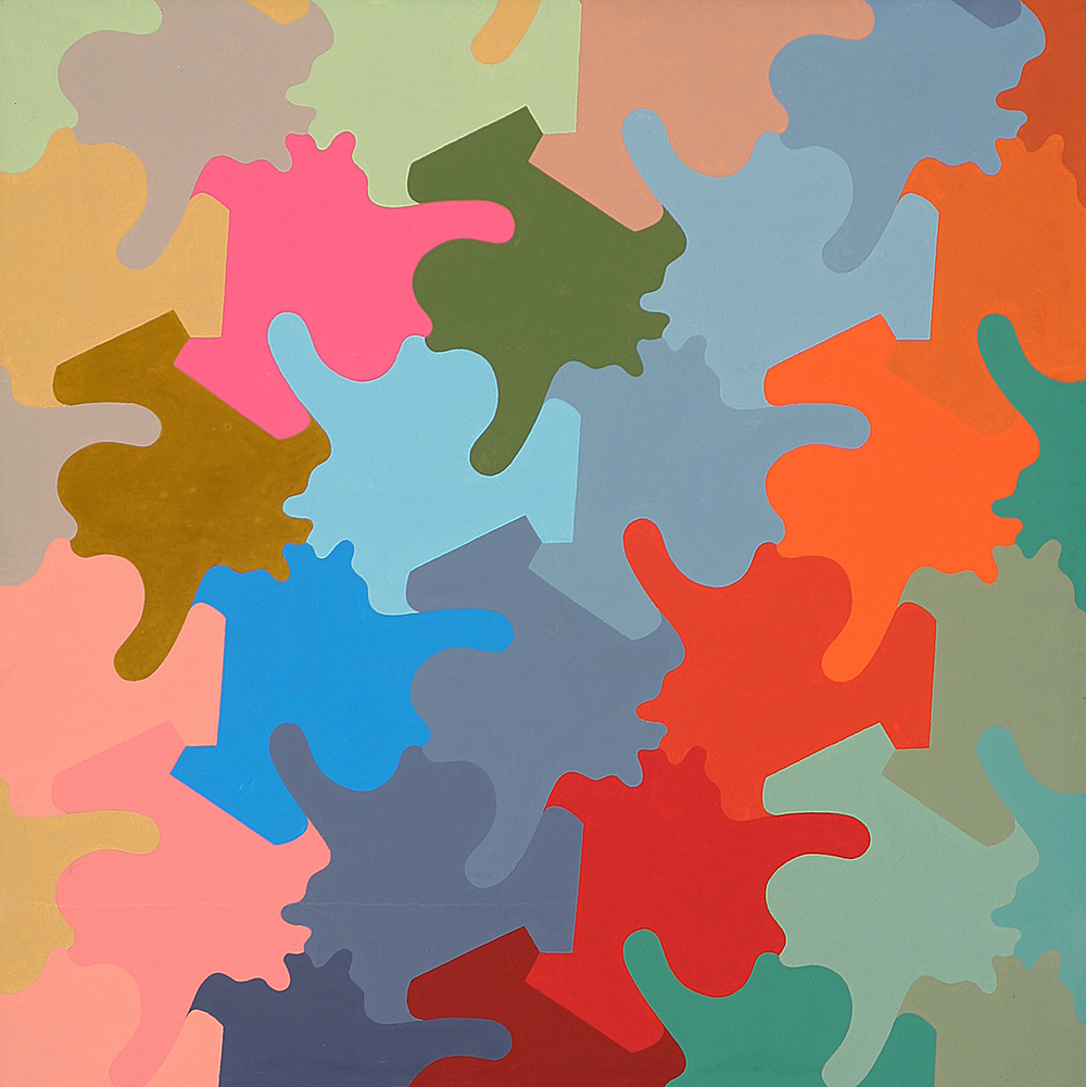
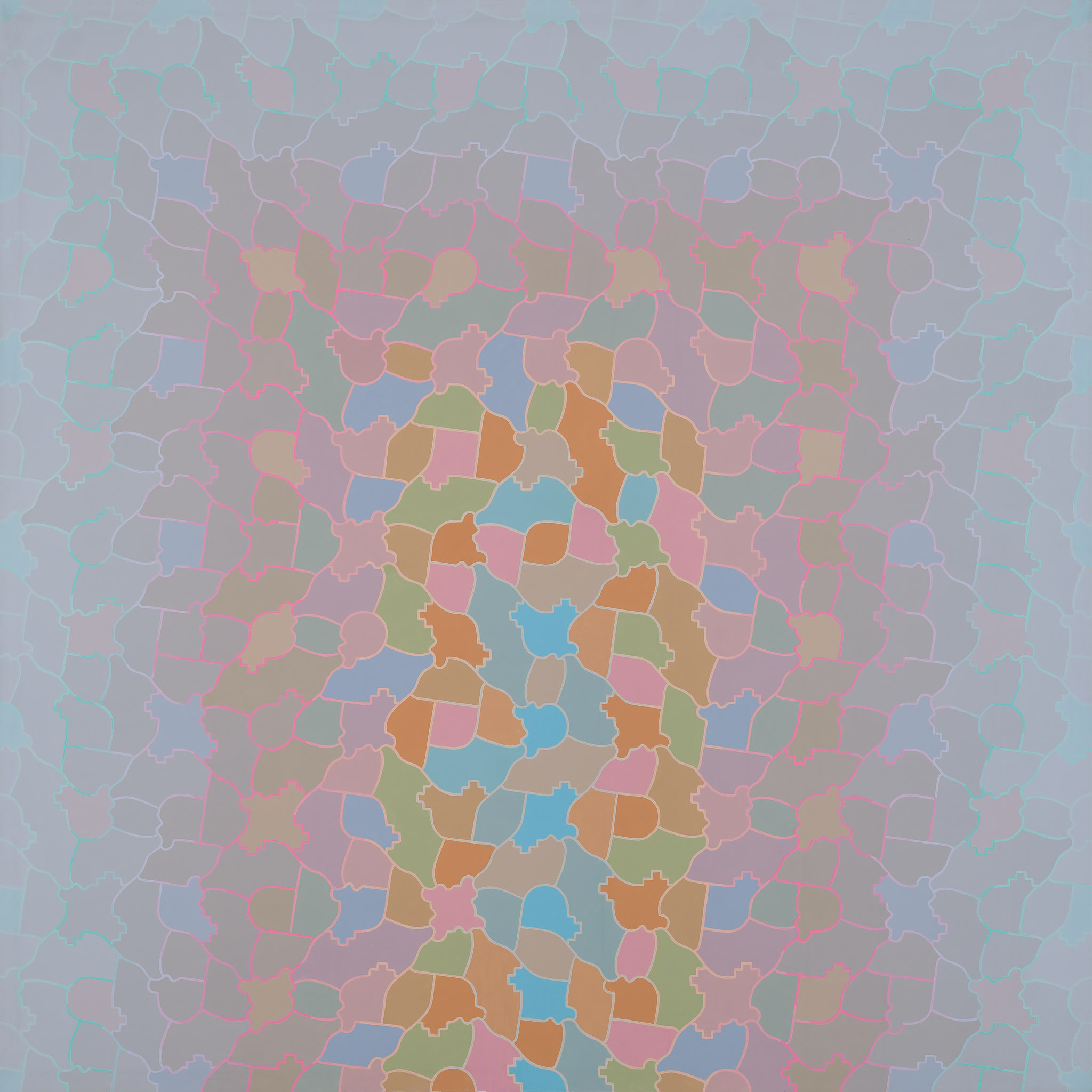
"Woodman appreciated how color could advance to the foreground in this context, structuring the viewer’s experience of the expanse… However, though his use of color in pattern paintings was initially regulated and systematic, as in A Gentle Tessellation, by the mid-1970s Woodman was using a more 'idiosyncratic and romantic' approach. In Grey Portal (1978) for example, he suggestively concentrates bolder colors in the center, surrounding them with progressively lighter pastel-gray tones that imply a dissipation or diffused focus toward the painting’s outer edges. This field is composed of almost entirely non-repeating tessellations, sometimes highly similar in form but largely unique, showing Woodman exchanging the regimented symmetry of his earlier work for an organic sense of echoing, and of growth and flux."
Rebecca Skafsgaard Lowery. “Infinite Progress: Criss-Cross and the Gender of Pattern Painting.” With Pleasure: Pattern and Decoration in American Art 1972-1985. Los Angeles: Museum of Contemporary Art, Los Angeles, 2019.

George Woodman. Cascade, 1974. 36 x 36 in. Acrylic on canvas.
"Such patterns have been an invitation to give color a prominent role as a formal element. When structurally the painting is an homogeneous extension of small parts, the control and guidance of attention, the scaling of contrasts, spatial articulation and the development of specific shape identities are all powers granted to the inflection of color. For some years I enjoyed using color and pattern elements in strictly serialized permutational systems. Now I find it more congenial to develop color within these inexorable patterns to ends more idiosyncratic and romantic. The degree of contrast or similarity among shapes, the frequency of their repetition, ease or difficulty of their recognition, intrinsic interest or monotony, ratio of edge to surface plus their absolute size have profound implications for the kind of color experience that can be realized in a painting. In planning new work I usually commence with a conception of color and develop a pattern which seems appropriate to the kind of total impact sought in the painting."
George Woodman. Excerpt from essay “Statement.” Criss-Cross Art Communications, 16 (1978).
George Woodman. For Louise, 1973. 51 x 63 in. Acrylic on canvas.
"While painting – again in Italy – [Woodman] tired of a troublesome work and painted it out with gesso. The effect was marvelous as the colors were visible as delicate tints beneath the white gesso. The result was an off-white pattern painting. The success of this accident led Woodman to paint a number of white paintings from scratch in the next few years. 'None are really white,' Woodman said because various shades were used."
Michael Paglia. “The Paintings and Photographs of George Woodman.” George Woodman: Sensuality in a World of Reason. Boulder: Boulder Museum of Contemporary Art, 1998.

George Woodman. Winterreise, 1976. 80 x 104 in. Acrylic on canvas.

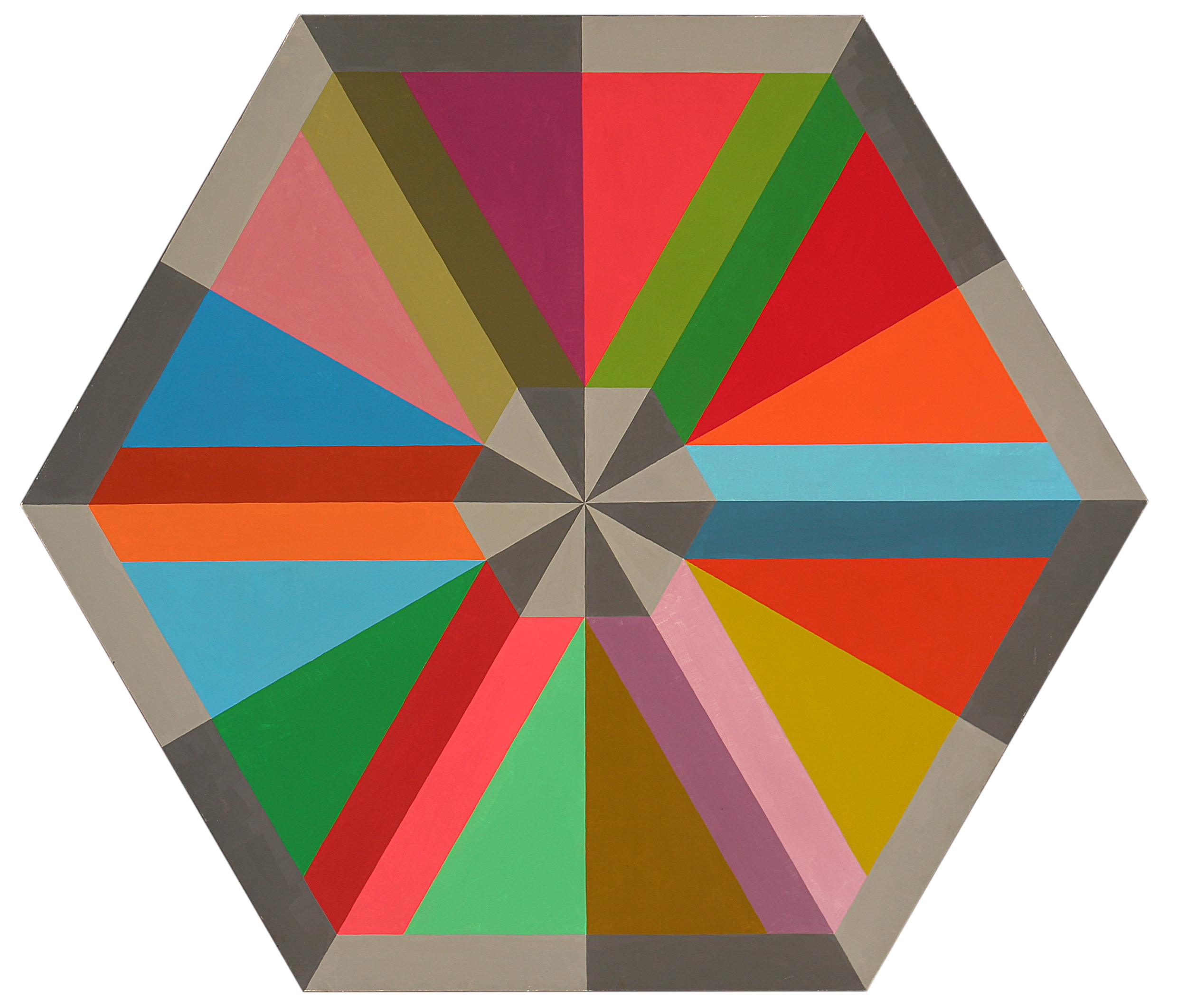
George Woodman. Color Octagon, 1975. 83 x 83 in. Acrylic on canvas.
"For a year or so I painted white paintings. What a relief to be free of dense color! These skeins of pastel tones are in fact further permutations upon the hexagon. It started with the Romans, burst into flower in Isfahan in the 13th century and ended up in my lap in the 1970s—Why me? The hexagon was becoming a cruel mistress. And my studio skylight leaked from melting snow, the gas heater hissed, I could hear the sound of someone shoveling snow across the street."
George Woodman. George Woodman: Paintings 1960-2000. Omaha: Bemis Center for Contemporary Art, 2006.

George Woodman. Euridice and Amor, 1982. 63 x 51 in. Acrylic on canvas / George Woodman. Psyche and Amor in the Wisteria, 1988. 20 x 16 in. Gelatin silver print.


“With their precise contours, uniform, dry shading, and pastel colors, tastefully adjusted, Woodman’s paintings of nymphs from the 1980s expressed a kind of tentative Apollonianism. Closing with his actual sources in black and white photographs that are painterly, the artist visualizes a duskier, more emphatic world.”
Max Kozloff. Museum Pieces: Photographs by George Woodman. New York: Lo Specchio d’Arte, 1996.

George Woodman. Bianca, 1984. 86 x 63 in. Acrylic on canvas / George Woodman. Society Girls: Alexandra with J. S. Sargent, 2012. 24 x 20 in.


"The 80’s sees the introduction of the female nude, harbored within a pale pattern of tulips and tendrils, as though she had been lurking all along within the unconscious of the prior abstractions. When, in the mid to late 80’s the female form is seen against a solid field of grey, she is abstracted, hypostasized."
Robert Berlind. George Woodman: Paintings 1960-2000. Omaha: Bemis Center for Contemporary Arts, 2006.

George Woodman. Untitled, c. 1980s. 77 x 55 in. Oil paint on canvas.
"...Woodman’s exquisite use of color as texture, especially the beautiful and striking contrast in the black and white photographs, is evident…In both the paintings and the photographs the viewer senses the delicate magic between line, form and shape."
Cydney Payton. George Woodman: Sensuality in a World of Reason. Boulder: Boulder Museum of Contemporary Art, 1998.

George Woodman. Pitti Screen, 2006. 37 1/4 x 48 1/4 in. Oil on gelatin silver print.
"The painted photographs of George Woodman are ripe with mental connections, rich evidence of the artist’s talent for noticing, for witnessing, for making new wholeness. These sensuous black and whites are intense with historical allusions, visual puns, and playful self-reference. Geometric swaths of color inhabit the photos, bringing them to life in a way that reveals Woodman’s history as a painter and his lifelong immersion in art."
Clayton Maxwell. “George Woodman.” Eyemazing 4 (2012).

George Woodman. Canova Museum, 2010. 42 x 36 in. Oil paint on gelatin silver print.

George Woodman. Sara on a Chair, 2007. 24 x 20 in. Oil paint on gelatin silver print.
“I find the black and white of photography to be themselves colors. When combined with the chromatics of oil paint, a duo, a dialogue, is created in which the two voices retain their separate identities yet sound in harmony. The pacing and dramatics of the picture becomes more resolved and my expressive intent is brought forward.”
George Woodman, 2012

George Woodman. Sara with Venus, 2007. 41 3/4 x 37 in. Oil paint on gelatin silver print.

George Woodman. Blue Arm and Chinese Maiden, 2012. 24 x 19.5 in. Oil paint on gelatin silver print.
"Woodman makes new wholeness from seemingly unrelated parts and the result is both mysterious and amusing. But the union that makes these images work is Woodman’s painterly placement of colour into his black and white photography. This chromatic shift comes naturally to Woodman given his background, and he does it with great balance and care. 'The insertion of color into a predominantly black and white situation was important in my paintings in the 70’s,' says Woodman in a recent email. 'I made a number of paintings that were chiefly black and white with a very restrained insertion of colour. What I am doing now in painting on my photographs is not as new, sudden or capricious as some may think. It has been a long story.'"
Clayton Maxwell. “George Woodman.” Eyemazing 4 (2012).
George Woodman. Untitled, 1974. 85 x 85 in. Acrylic on canvas.
“As the art critic Robert Berlind wrote about Woodman in a catalogue of his earlier work published by the Bemis Center for Contemporary Art, 'Colour is approached as a keyboard upon which precisely calibrated harmonies are built.' That harmony perseveres in his most recent photography.
These painted photographs not only blur the lines between photography and painting, they also blur the lines between colour and black and white photography. 'In the culture of painting,' says Woodman, 'black, white and gray are simply colours among others. But in photography, until recently, they have designated two KINDS of photography, B&W and COLOUR, with different films, papers and chemistry. And each even posing a different aesthetic stance. About 10 years ago I became involved in colour photography in which the subject (still life, model, flowers, whatever) always included a black and white photograph…The point of the series was to make a colour photograph of a black and white photograph which was expressively convincing in the context in which it was presented. It was a fascinating experience.'"
Clayton Maxwell, “George Woodman.” Eyemazing 4, 2012.

George Woodman. Nancy in my Studio, 2005. 24 x 20 in. Oil on gelatin silver print.

George Woodman. Leonora of the Blue Ribbon, 2002. 24 x 20 in. Chromogenic print.
Francesca Woodman’s photographs reveal carefully choreographed performances for the camera. In her photographs and videos, she stages and sequences her own body in space, creating fragments of subjective and symbolic dramas.

All works by Francesca Woodman. Self-Deceit #1-7, 1978. Gelatin silver prints. Variable dimensions.


Click on any image for a complete gallery view with details and additional works.
As Kathrin Hixson states, “Almost all of [Francesca Woodman’s] photographs are records of performances staged for the camera: some muted and solemn, others histrionic and theatrical, some highly orchestrated, others casual and spontaneous. This performative element in the work creates a sort of symbolic narrative played out in specific private actions, in which Woodman experiments with the interrelationships between the body, time, and space. She sometimes conflates these essences so that they are an inextricable continuum that resists representation. In a series entitled 'Self-Deceits,' her figure appears in a decaying interior shallow space adopting various poses in relation to a large piece of mirror. The mirror reflects only glare or darkness, and the figure is constantly blocked by its aggressive reflection of emptiness. The clarity of the mirrored reflection, as well as that of the photographic record is thwarted, as if to suggest that any simple representation is not sufficient to portray an individual or idea."
Kathrin Hixson. Francesca Woodman, Photographische Arbeiten/Photographic Works. Zurich: Shedhalle; Munster: Westfälischer Kunstverein, 1992.

All works by Francesca Woodman. Spring in Providence #1-4, 1976. Gelatin silver prints. Variable dimensions / Project sketch for Spring in Providence by Francesca Woodman, 1976.


"This series reveals a narrative as conceptual as it is poetic and humorous. In the first photograph Francesca Woodman appears wearing her dark overcoat, next to a long roll of white paper hanging vertically from the wall, while in the following image she is observing with interest, after an omitted interval of time that we know has gone by even if its passage has not been recorded, some marks on the paper from which, with the aid of a pair of scissors, some luxuriant cabbages sprout (photograph no. 3). Once anticipated the change of season on a paper that conceptually joins the fictitious with the real, once smashed its bi-dimensionality, the artist returns with a vengeance in the photographic representation. Francesca, the allegory of Spring, moves away in the fourth stage of the series, perhaps in order to get rid of an unnecessary cover when the good weather arrives. Interventions, performance, sculpture, photography."
Isabel Tejeda. “Portrait of the Artist as an Adolescent: Francesca Woodman, Strategies of the Imperceptible.” Francesca Woodman. Milan: Silvana Editoriale Spa, 2009.

Francesca Woodman. Untitled, 1980. Gelatin silver print. 1) Approximately 4 x 10 in. 2) 4 1/2 x 4 7/16 in. 3) 4 1/6 x 3 13/16 in.


"What I think it safe to say is that a recurring motif is 'Francesca' undergoing some form of metamorphosis, from one state of being into another. In a set of images made when she was resident at the MacDowell Colony, she pictures herself in a stand of birch trees. Sometimes she appears nude, with strips of birch bark around her arms. At other times she is wearing a dress, but without arms—already a trunk. In other images she wears the dress and displays her arms encased in birch bark. It feels as if she is enacting the myth of Daphne being transformed into a tree."
Arthur Danto. “Darkness Visible: Francesca Woodman.” The Nation, 15 Nov. 2004.

Stills from Francesca Woodman, Selected Video Works, c. 1975-78. Half-inch black-and-white open reel video with sound, transferred to DVD, 11:43 minutes.


"Initially at least, video seemed to offer Woodman the opportunity to vivify her photographs. Whether still or moving, her images document a performance for the camera. In her journal, she parenthetically asked herself, 'are blurs possible in film,' revealing her desire to translate her photographic language into the moving image…She is not interested in a narrative arc, whether verbal or through a succession of scenes. Instead, the video camera records from approximately the same fixed point from which her still camera would. Woodman seems to have been relatively unmotivated by the new perceptual experiences that early video artists were exploring, most likely because her concerns revolved around performance and its documentation as opposed to structuralist investigations of the medium. Nevertheless, the video camera allowed her to expand on the temporal concerns of her photography by means of movement within the frame, zooming in and out of the image, and the duration of the tape itself."
Jennifer Blessing. Francesca Woodman. San Francisco: SFMOMA in association with DAP, New York, 2011.

Stills from Francesca Woodman, Selected Video Works, c. 1975-78. Half-inch black-and-white open reel video with sound, transferred to DVD, 11:43 minutes.


"The video of her silhouette on the floor reveals the performance process which led up to her photographs. This involved using her body to organize the space, and a careful preparation of the scene before the actual shot. She would take a series of shots, and then choose to print only one or two. This was her method. However, the preparatory phase of constructing the photograph was not only performance (stripping, covering the body with pigment, dressing in clothespins), but also involved the construction of space—or rather, the choice of place and the location of objects in the scene.
While the pre-photographic phase included performance aspects (with regard to the body), we can also note aspects of installation in the artist’s pre-planned picture frame.
In other words, Woodman prepared the space in which she then placed herself. She mounted the camera on a tripod and then proceeded to test, endlessly verifying the objects, the light, and so on, looking through the lens, and imagining herself in the space she had conceived."
Isabella Pedicini. Francesca Woodman: The Roman Years Between Flesh and Film. Rome: Contrasto, June 2012.

All works by Francesca Woodman. Untitled, 1976. Gelatin silver prints. 1) 5 1/2 x 5 1/2 in. 2) 5 11/16 x 5 11/16 in.

"The studio becomes the stage for a subjective drama as well as for the transformation of [Woodman’s] body into a canvas on which she can leave signs of herself. In these self-performances her naked body is both the subject as well as the instrument with which she renders herself visible. At the same time in the two subsequent photographs a peculiar correspondence is at stake between the materiality of the self-presentation (body, paint, flour) and the mediality of its performance (floor, paper, videotape, photograph). The artist not only produces a bodily imprint of her figure, but also represents herself a second time, positioned in relation to this silhouette. The ephemerality of the first forms of depiction—the materialized photogram on the floor, which turns the dusted floor into photographic paper—counterbalances the permanence of her shape in the photograph taken afterwards. What the video performance could only capture as a sequence of individual moments the frozen movement of the photograph endows with an arrested poise. If the engendering of the first representation requires that the artist put an end to the tableau vivant she is staging (the reclining statue) by leaving the scene, her disappearance from our view allows the persona 'Francesca Woodman' to appear in a double sense: as a representation of herself which she has left behind and as an artist who has returned to her work, though once again as a figure in a double self-portrait."
Elisabeth Bronfen. “Leaving an Imprint: Francesca Woodman’s Photographic Tableaux Vivants.” Francesca Woodman: Works from the Sammlung Verbund. Köln: Buchhandlung Walther König and New York: Artbook, 2014.

All works by Francesca Woodman. Space², 1976. Gelatin silver prints. 1) 10 x 8 in. 2) 5 15/16 x 5 11/16 in. 3) 5 7/8 x 5 7/8 in. 4) 5 15/16 x 5 11/16 in.


"In Untitled (Providence, Rhode Island, 1976) Woodman undertakes a performance for the camera, adopting a variety of positions and enacting different gestures – kneeling, skipping, stepping, jumping – which are blurred by the prolonged exposure. Onto a number of the small squares of the contact sheet she then draws crude rectangles, which seem to contain her as she lies in a corner, or through which she steps and bends, or, in one image, which appear to distort as she kicks out."
Chris Townsend. Francesca Woodman. London: Phaidon Press, 2006.

All works by Francesca Woodman. Untitled, c. 1972-74. 1-2) Approximately 6 3/16 x 6 3/8 in. 3) 6 1/16 x 5 3/8 in.4) 7 1/4 x 5 in. Gelatin silver prints.


"These photographs do not show a body at ease or rest; instead, they show muscles taut, body contorted, and even her face peeking out from under a pile of branches. In these…works, Woodman does not make her body available for easy consumption by the (male) viewer’s gaze. Indeed, they reveal, unintentionally or not, the effort and work that is part of her staging and her performance. Woodman challenges rather than conforms to the cliché she tangles with; these images are active and they show a figure alive and in motion. They also put into play a trope that recurs throughout Woodman’s career, that of emerging from or dissolving into her environment. To what extent does her draping hair suggest a blending of body with setting? Or, to what extent is her body moving into the naturally created crevice, as opposed to exiting?"
Nora Burnett Abrams. Francesca Woodman: Portrait of a Reputation. New York: Rizzoli Electa, 2019.

Stills from Francesca Woodman, Selected Video Works, c. 1975-78. Half-inch black-and-white open reel video with sound, transferred to DVD, 11:43 minutes.


"We initially see Woodman’s silhouette behind a large piece of white paper hung like a curtain in front of the window of her studio. Her right hand soon emerges above the upper edge of the paper and begins to inscribe her given name in black pen on the white surface…For a few moments, we once more see the silhouette of her entire body through the backlit paper, only now the letters of her name run across the white sheet at the level of her waist. Both hands suddenly appear in front of the paper, grab it, and begin to tear strips from it. The body of the artist hidden behind the paper curtain bearing her name gradually comes into view. Having completely revealed her upper body to the viewer’s gaze, Woodman stands still for several seconds, again striking a pose.
…The woman making her appearance is not identical with the name that stands in for her. In order to appear she must tear her signature apart and walk through it. At issue are several programmatic stages of emergence. At first the actual embodiment of a traditional image-form (Venus) replaces the name that belongs to it (and as such designates the performer in the scene and the artist creating it). This self-expression, based on an inherited canonical image of female beauty, not only replaces the signature but also endows the silhouette, which stands at the beginning of everything, with the facial features of a particular person: Francesca Woodman. Once the paper has been completely torn to shreds, this animated self-image also disappears from view, to be replaced, in turn, by a drawn self-portrait."
Elisabeth Bronfen. “Leaving an Imprint: Francesca Woodman’s Photographic Tableaux Vivants.” Francesca Woodman: Works from the Sammlung Verbund. Köln: Buchhandlung Walther König and New York: Artbook, 2014.

All works by Francesca Woodman. My House, 1976. 5 3/4 x 5 5/8 in. / From Space², 1976. 6 3/8 x 6 3/8 in. Gelatin silver prints.

"Even as the House and Space2 images showcase temporal distortions, in these images Woodman’s affinities with the feminist performance art of her era are striking. Her work elides the boundaries between genres, thus coming to rest as photography not so much in its inception as in its reception. I do not mean that Woodman did not conceive of herself as a photographer: clearly she did. But the genius of Woodman’s works is the scene, the symbolic torque. Her power is oneiric and her work has the aura of fate. In this, she deploys the photograph as a sign of fate—never an actual truth but an encoding of an image that appears as truth—that which is written for us."
Claire Raymond. Women Photographers and Feminist Aesthetics. London and New York: Routledge, 2017: 15-16, 50, 102-116.

All works by Francesca Woodman. Untitled, 1976. Gelatin silver prints. 1) 5 7/8 x 5 7/8 in. 2) 5 3/4 x 5 3/4 in. 3) 6 1/16 x 6 9/16 in.


"The tableaux vivants Woodman repeatedly puts on display in her artistic practice thus need not only be read as anticipating and rehearsing death. They can also be seen to celebrate a precarious recovery of aesthetic presence by capturing a scene in which the body is stage[d] simultaneously as an image and as the producer of that image. The interface she insistently charts between disappearance and appearance in the image and as the image uses ephemerality as the precondition for the creation of new figurations. Her artistic oeuvre thus puts on displays her idiosyncratic blend of theatrical performance of subjective moods with an exploration of visual formalization. Woodman deploys her own body as material medium and as the object in the photograph so as to intervene in the traditional image repertoire of art history."
Elisabeth Bronfen. “Leaving an Imprint: Francesca Woodman’s Photographic Tableaux Vivants." Francesca Woodman: Works from the Sammlung Verbund. Buchhandlung Walther and Artbook, 2014.

All works by Francesca Woodman. Untitled, 1979. Chromogenic prints. 1) 3 5/16 x 3 1/2 in. 2) 3 5/16 x 3 1/2 in. 3) 3 3/8 x 3 1/2 in.


"Francesca is closer to [Cindy] Sherman, it seems to me, in that she never shows herself as herself. The difference is that she always shows herself as the same character—the character of a young woman in various mise-en-scènes. The work, in other words, has a subtle fictive dimension, which is all too easily overlooked by those in search of biographical cues about her tragic end. We have to distinguish between Francesca the artist and 'Francesca' her character, as we do between Marcel Proust and the narrator 'Marcel'—or between Franz Kafka and the protagonist of The Trial, 'Josef K.'"
Arthur Danto. “Darkness Visible: Francesca Woodman.” The Nation, 15 Nov. 2004.

All works by Francesca Woodman. Untitled, c.1977-78. Gelatin silver prints. 1) 4 7/16 x 4 1/2 2) 4 1/8 x 4 1/7 in. 3) 3 13/16 x 3 7/8 in.


"Over and over in Francesca Woodman’s photographs, the body—her own body—is caught at that precise point where motion becomes repose, where a fleeting gesture settles onto paper."
David Levi Strauss. “After You, Dearest Photography: Reflections on the Work of Francesca Woodman.” Between the Eyes: Essays on Photography and Politics. New York: Aperture Foundation, 2003.

All works by Francesca Woodman. Untitled, c. 1977-78. Gelatin silver prints. Approximately 3 1/8 x 3 1/8 in.


"But Francesca Woodman was not simply a performance artist, because photography held a fundamental position of privilege within her art making.
Obviously the use of the body as an instrument does not alone define a body artist. Woodman’s investigation into the self, the diaristic component of her work, and her exploration of a private world were also qualities which served to align her with the body artists.
Yet her discourse diverged, as she used the camera to gather the traces of her performance. Her instrument stopped moments in a private existence.
Performance functioned as a part of her photography, not vice-versa. It corresponded to a compositional means which is part of that language. It represented one phase of the picture-making process, a preparatory moment prior to the snapping of the self-portrait.
'It’s a matter of convenience, I photograph myself because I am always available,' she declared ironically, but this apparently dismissive stance was part of a meditative, lucid discourse on a well-weighted poetic language played down by a light touch."
Isabella Pedicini. Francesca Woodman: The Roman Years Between Flesh and Film. Rome: Contrasto, June 2012.

Francesca Woodman. Untitled, c.1977-78. 3 1/8 x 3 1/4 in. Gelatin silver print.
Betty Woodman’s ceramic vessels often act the role of figure: animating her implied rooms and theaters and gesturing towards each other in suggested conversations. Whether assembled in small crowds or posing within her carefully constructed mise-en-scenes, Woodman’s sculptures embrace the bodily affinities inherent in clay’s history while also nodding to the histories of painting and performance.

Betty Woodman. Still Life Vase: 11, 1990, side A and side B. 35 x 30 1/4 x 9 5/8 in. Glazed earthenware, epoxy resin, lacquer, acrylic paint. Collection Whitney Museum of American Art, New York.
Click on any image for a complete gallery view with details and additional works.
“…[T]hese freestanding works attain considerable sculptural presence. They do so as metaphors for the human body. Woodman has not tried to make ‘ceramic sculpture’ after the model of sculpture in other mediums but has expanded upon a historic ceramic identity. The association of pottery with the body is revealed in the names of vessel parts such as foot, lip, shoulder, neck, belly, etc. Woodman has amplified this equation, creating ceramic bodies with gesturing arms, clothed in painted patterns. The vessels’ relationship to the human body is more apparent in reality than in photographs, which lack indications of scale: all the Kimono Vases and Still Lifes, for example, are torso height…Dividing the vases into front and back so that they are seen simultaneously as low-relief planes and as volumes furthers the parallel with the peculiar, distinctive three-dimensionality of the human body.”
Janet Koplos. “From Function to Form.” Art in America, Nov. 1990: 166–71.

Betty Woodman. His / Hers Vases: Cinzia Posing, 2007, side A and side B. 32 x 54 x 9 in. Glazed earthenware, epoxy resin, lacquer, paint.
"The idea for the shapes [for His / Hers Vases] came from seeing a curious chaise lounge for two. This is a complicated game in which ceramics is both the subject and ground for a still life painting. First, there’s an actual bowl and vase. Second, there are images of classic archaic pots cut out of clay and attached to these. Third, other classic forms are painted across all of them. In this way I continue to layer and enjoy the nuances of ceramic forms, such as the dip of a lip, the curve of a belly and the hesitation of a shoulder. I try to make art which appreciates the richness of ceramic history but does not try to imitate it."
Betty Woodman. Betty Woodman: Between Sculpture and Painting. Fort Dodge: Blanden Memorial Art Museum, 1999.

Betty Woodman. The Ming Sisters, 2003, side A and side B. 32 x 81 x 8 in. Collection Metropolitan Museum of Art / Betty Woodman. Posing with Vases at the Beach, 2008, side A and side B. 33 x 81 x 6.75 in. Glazed earthenware, epoxy resin, lacquer, paint.


"This approach is seen at its best in her two-sided works in the form of double-or triple-related figures that play on the pot’s relationship to the body. Essentially flat cutout pieces that flange off a columnar base, they are painted with different images on front and back. So that you can’t say you’ve really seen them without looking on both sides. In The Ming Sisters (2003), a monumental triptych inspired by Japanese and Korean arts and crafts, each piece is cut out in a different but similar configuration. They stand coquettishly in a row, their bright white gowns adorned with childlike floral motifs in lively colors on one side, a gleefully different set of patterns on the reverse. Here, too, the sharply outlined spaces between figures, ghostly gray intrusions, play an important role in the presentation of the figures."
Grace Glueck. “The Humble Vase Shows Its Colors and Its Versatility.” The New York Times, 28 Apr. 2006: E33, E36.

Betty Woodman. Theater 4, 2003. 31 x 40 x 19 in. Glazed earthenware, epoxy resin, lacquer, wood, paint.
"This is also where the theater begins in Woodman’s work: when more than one of the vessels get together. Seeming both connected and separate, her diptychs and triptychs of freestanding vases interact with one another as if they are characters in a drama. Woodman choreographs the groups in rhythmic relational positions; they incline toward each other in animated anthropomorphic postures, their limbs gesticulating with a motion implied by their dynamically cutout forms. Wishing to stimulate our imaginations while supplying as little information as possible, Woodman also counts on our historical association of the ceramic vessel as a metaphor for the human body."
Cathryn Drake. Betty Woodman: Teatros. Théâtres. Theaters. Milano: Skira Editore, 2005.

Betty Woodman. Three Atlanta Dancers, 1989, side A and side B. 22.5 x 54 x 9 in. Glazed earthenware, epoxy resin, lacquer, paint.


"Betty Woodman’s works often consist of two or more vessels, unified by surface patterns and the implied gesture of their appendages, while juxtaposed as if they were engaged in some sort of performance, the meaning of which is reflected in which their shapes and sizes relate to one another. Such works are thus ensembles of internally co-responsive parts—a duet, as it were, or a trio—as in a musical composition or a dance or, in a theatrical piece, a scene of intimate interchange..."
Arthur Danto. Betty Woodman. New York: The Monacelli Press, 2006.

Betty Woodman. Aeolian Pyramid, 2001/2006. Approx. 150 x 168 x 100 in. Glazed earthenware, wood, paint. Installation view, The Art of Betty Woodman, Metropolitan Museum of Art, New York, 2006.
"Taking full advantage of the clay pot’s anthropomorphic qualities, Woodman created spontaneous theater by arranging groups of them on pedestals and platforms. The Aeolian Pyramid (2001) was inspired by excavated ancient amphorae lined up on graduated shelves in the archeological museum on Lipari Island in Sicily. The curvaceous terra-cotta containers are especially evocative of the human body, most particularly when assembled en masse. Placed on stepped rows reminiscent of a Greek amphitheater, Woodman’s 35 large slender vessels look like a noisy audience dressed in lively patterns—actually urn fragments painted on the vase-shaped facades of the figures. Together the designs and the undulating forms—in addition to their sheer number—produce the illusion of bodies in motion."
Cathryn Drake. Betty Woodman: Teatros. Théâtres. Theaters. Milano: Skira Editore, 2005.

Terracotta Wine Amphora, Roman, ca. 100 BC. 40 1/2 in. tall. Courtesy of The Metropolitan Museum of Art, New York.
"...[T]he dynamic is miraculous in Aeolian Pyramid, a stepped array of thirty-five big, slab-presenting vases of abstracted Greek design in black, yellow, and pale terra cotta. The composite keeps squeezing out real space, which keeps muscling back in. The result is a visual 'Hallelujah' Chorus."
Peter Schjeldahl. “Decoration Myths: Betty Woodman’s Ceramics.” The New Yorker, 15 May 2006: 89-90.

Betty Woodman’s studio in Antella, Italy, 2004.
"…[B]oth analogies I find myself spontaneously using—chorus and caryatid—bring out some deep affinities between vases and human beings, since after all there are ways in which we may be regarded as vessels and in which the vase, as a particular vessel, makes reference to our form. The balustrade vases are distant abstract cousins to the stunning Chin dynasty terra cotta soldiers revealed as an archeological wonder a few years ago."
Arthur Danto. Betty Woodman. Amsterdam: Stedelijk Museum, 1996.

Betty Woodman. Kimono Vases: Sunrise, 1990, side A and side B. 36 x 43 x 9 in. Glazed earthenware, epoxy resin, lacquer, paint / Betty Woodman. Three Okinawan Women, 1983, side A and side B. 12 x 38 x 6 in. Glazed earthenware, epoxy resin, lacquer, paint.

"Another convention that Woodman has played with is figurative symbolism. The equivalence of pot to body is age-old and is reflected in the terminology of the pot’s parts—lip and mouth, shoulder, belly, and foot. Woodman has taken the relationship as a given and has used the figurative identification as a kind of motivating factor for the 'postures' of her vessels. This began as early as [1983], with her Three Okinawan Ladies. Here, using the color scheme of Okinawan folk pottery popularized and introduced to the West by Shoji Hamada, the exemplar of the Mingei movement, Woodman has linked the ladies in what might be a traditional dance, the loop handles like arms in synchronized poses. More recently, in her 'Kimono' [diptychs], the painted vases suggest garments, sometimes explicitly echoing textile patterns. She went even further when she used actual textiles she had acquired in India, cut and tied onto vessels in her 2002 Fabric Girls installation. Here some handles mimic projecting elbows in 'pin-up girl' poses."
Janet Koplos. Betty Woodman. New York: The Monacelli Press, 2006.

Betty Woodman. Kimono Ladies, 2016. Variable dimensions. Collection of K11 Art Foundation. Glazed earthenware, epoxy resin, lacquer, paint, fabric / Betty Woodman. Pudukkottai Girl, 2002. 34 x 21 x 9 in. Glazed earthenware, epoxy resin, lacquer, paint, fabric / Image on left in second slide: Sculpture at Angkor Wat, Siem Reap, Cambodia.

Betty Woodman: Right, so I can look at images of Japanese women in Kimonos. When you have triptychs you have different shapes, but when you have a diptych, the void is in the middle, and your eye is drawn to it. So the diptych was formally dealing with the space in between in a different way, making it the centre of what one was looking at. Then the so called handles or wings that I was using to extend the thrown form reminded me of the way the body looks in a Kimono. The Kimono creates its own form but you’re aware of the body inside it.
Katherine Stout: Which is very sculptural...
BW: Exactly, it was very sculptural, so I made a lot of Kimono vases and I looked at a lot of Japanese screen paintings. For the piece in the show, the “Kimono Ladies,”I asked my friend and fashion designer Esther Gauntlett if she could make the costumes if I chose the fabrics. I had been interested in somehow dressing the vases, for me the vase always has the connotations of the figure. When we went to Angkor Wat and saw amazing temples with sculptures which were dressed in robes, I started to think how this has always been around. When you go to a church and it’s a Saint’s day, they dress up the statue and they take her on procession. The idea of sculpture which is dressed, literally, has been around for a long time.
Interview with Katherine Stout. Betty Woodman: Theatre of the Domestic. Milan: Mousse Publishing, 2016.

Betty Woodman. Women at the Fountain, 1992. 86 x 144 x 57 in. Collection of the Flemish Community, Belgium / Betty Woodman. Conversations on the Shore, 1994. 84 x 124 x 41 in. Both glazed earthenware, epoxy resin, lacquer, acrylic paint.

"Vases have been traditionally viewed as bodies; their anatomies are denoted in human terms—the mouth, neck, belly, ears, feet. This can be very evident in Woodman’s work, as in Women at the Fountain. In this large installation, cut out vase shapes on the wall refer to architecture, while women/vases in the foreground engage in a game of movement, and in the middle background two monumental jugs appear to converse. All is simultaneously illusion and movement."
Liesbeth Crommelin. Betty Woodman. Amsterdam: Stedelijk Museum, 1996.

Betty Woodman. Winged Vase: Santa Chiara, 1991, side A and side B. 22 x 23 x 16 in. / Betty Woodman. Vase Upon Vase: Diana, 2009, side A and side B. 66.5 x 23 x 17 in. Both glazed earthenware, epoxy resin, lacquer, acrylic paint, wood / Image on left in third slide: Terracotta stand, ca. 520 BC. 10 1/4 in. Courtesy of The Metropolitan Museum of Art, New York.


Betty Woodman: …What happened was that after I came back from Italy to New York, I kind of wandered around for a while not knowing quite what to do, but then I started looking at older things of mine that had been in the show at the Met and thinking, “That’s really a nice piece, I did that a long time ago,” and decided that I could repeat myself. I could go back and use my own material, it was mine, there was no one to say I couldn’t copy myself. I actually started with a specific piece which had a kind of wing on it, and was in some way inspired by a very small Greek sculpture, a Tanagra figurine—actually it’s probably more accurate to say an Athenian figurine. So I looked at that and thought, I really like that, especially the gesture of the clay, and I started making, on a larger scale, a series of pieces with a wing.
Barry Schwabsky: Your original piece, when was that done?
BW: I think it was probably done in the ‘80s, maybe early ‘90s.
BS: It was something you’d done as a single piece and hadn’t developed further?
BW: No, I developed it, I did a whole series. They were closer to the Athenian figurine, which as I remember was probably about eight or ten inches high. On one side there was a conventional image of a classic Greek pot with a decoration on it, and then on the other side it became an angel and the angel had wings. So half of the sculpture was a pot. And it was really fascinating to me. But what happened with this project was that it led me to doing pieces where I think I finally faced up to being a sculptor. And I gave these winged figures a wooden base, which for me was a sculpture about a base, and the vase on top of it was really a sculpture about a vase. I put these two things together and they became much less frontal. You know, I think a lot of my work is flat, but this became a piece you really had to move around to understand.
BS: Yes, your pieces often have this planar aspect to them, but somehow what you understand about the thing when you look at it from one side is completely different from what you understand when you look at it from the other—for instance these new pieces you have here in the studio where when you look at them from one side you see them as representations of vessels, and on the other side they become representations of a figure.
BW: This is something that has intrigued me for a long time. I used to have whole apologia for it, that the piece had two different moods and so on. But then at a certain point it just seemed more honest to admit to myself that it takes a lot of work to make these pieces, they’re big and complicated and I really like to paint—so I’m giving myself two different sheets of paper, in a way. I can do two different things. I think with these new large pieces with the figure, they are coming right back to that Athenian figurine, it’s got that kind of a reference. So on the one side it’s the image of a classical decorated Greek pot, and then on the other side, it was just a matter of outlining the form, where I wasn’t thinking of a figure at all, there it was, then putting two breasts on them, and the handle becomes an arm and how anthropomorphic it is! I did the first one last summer and it was like a gift. I didn’t struggle over it.
Interview with Barry Schwabsky. Betty Woodman. New York: Salon 94 and Skira, 2011.

All artworks by Betty Woodman. A group of Venuses / Venus #9: Swedish, 2014, side A and side B. 39 x 14.25 x 5.5 in. / Venus #10, 2014, side A and side B. 39.5 x 14.5 x 5.25 in. All glazed earthenware, epoxy resin, lacquer, acrylic paint, cement.


"I’m attached to the vase. It’s existed as long as man has made art. Everywhere—in painting, sculpture, wall paintings, Roman mosaics, fountains—there’s usually some vessel. It holds something, it’s a universal symbol for a woman. In each piece here, there’s a vase, its fragment or handle, it’s a wall image, it tops a column or a person. The flat two-sided “Venus vases” are new—I’m letting go of the vessel. They don’t hold anything, but they’re shaped like vases. One side is painted as a ceramic vase, the other became a female figure so I drew breasts, a navel, and pubic hair on it. They’re like drawings, amusing surprises."
Betty Woodman in an interview with Vibhuti Patel. “An Art Traveler Lets Go of the Vessel.” Wall Street Journal, May 7, 2013.

Betty Woodman. Of Botticelli, 2013. 10 1/2 ft x 3/4 in. Glazed earthenware, epoxy resin, lacquer, acrylic paint / Installation view, Betty Woodman at Museo Marino Marini, Florence, Italy, 2015 / In third slide: Sandro Botticelli. Primavera, c. 1480. 207 x 319 cm. Tempera grassa on wood. Courtesy of Uffizi Gallery, Florence, Italy / Installation view, Betty Woodman. A Visit to Rome, 2009. 8 x 90 ft. with 50 water jets. Bronze, patina, copper piping. Private collection, Perugia, Italy.


Betty Woodman. Lady and Leaning Vase, 2011. 85.5 x 43.75 x 0.5 in. Glazed earthenware, epoxy resin, lacquer, acrylic paint / Image on right: John Singer Sargent. Mrs. George Swinton (Elizabeth Ebsworth), 1897. 90 3/4 x 48 3/4 in. Oil on canvas. Wirt D. Walker Collection. Courtesy of The Art Institute of Chicago.
"I made Of Botticelli one dreary, late winter. Its columns, ribbons and vines reminded me of Botticelli’s Primavera, though my ceramic mural is not a specific response to it. In this work, the column is not just an architectural reference but also stands in for a figure, a balletic parade of ladies carrying vases and flowers. This is often the case in my work: one can see it in my 'portrait paintings' made from ceramic and painted canvas with 19th Century portraits by John Singer Sargent in mind, and the sprawling bronze fountain, A Visit to Rome."
Betty Woodman. Artist statement, 2016.

Betty Woodman. Finestra con Persiane 2, 2009. 97.25 x 84 x 15.75 in. Glazed earthenware, canvas, paint.
"It is no coincidence that the recent Finestre con Persiane 2 (2009) positions the reclining female semi-nude of tradition in an awkward position, almost falling out of the surface, while the window is emphatically three-dimensional, as well as positioned at an angle to imply a room. All this in a perspectival illusion we know only too well from the history of western painting.
It takes a split-second, a brief but crucial temporal delay, to realise that this figure has, indeed, fallen out of the surface, for she is reclining, straight up, on the surface of a vase standing in front of the painting. The perspectival illusion the window hints at is mercilessly rejected. This vase, in turn, recalls the shape of an antique amphora to which the female figure, traditional maker of such vessels, traditional subject of such depictions, clings unflatteringly, with a decidedly un-cheerful facial expression. This figure-vase stands outside the canvas, on the gallery floor, but casts its shadow on the purple painted surface behind it, so that it participates in the painting."
Mieke Bal. Betty Woodman. Brescia: Galleria Massimo Minini, 2009.

Betty Woodman. The Couple, 2013. 61 x 61 x 8.5 in. Glazed earthenware, epoxy resin, lacquer, acrylic paint, canvas, wood / Betty Woodman. Fra Angelico’s Room, 2012. 94 1/2 x 90 x 13 in. Glazed earthenware, epoxy resin, lacquer, acrylic paint, canvas.

"These are 'rooms' painted on canvas against which vases resting on the floor are juxtaposed, like theatrical figures on a stage, and subtle ceramic fragments float upward. Gradually losing their functional aspect—but never entirely!—the vases here assume a sort of anthropomorphic quality and the compositions allude to inhabited spaces. The backdrops are colorful spaces with perspectival depth, which heightens the theatrical sense of the representation: doors and windows, painted on the vases themselves and on the walls of saturated colors, create illusionistic effects and overlaps. These are actual places in which 'actions' occur in real time, domestic theaters where silent dialogues take place between historic figures or between architectural elements and human figures."
Ida Panicelli. Betty Woodman. Brescia: Galleria Massimo Minini, 2009.

Betty Woodman. Conversation, 2012. 23 x 50 in. Acrylic paint, terra sigillata and pencil on handmade Nepalese paper.